Stop Customers in Their Tracks: The Psychology of Brand Colours That Truly Work for Kolkata Audiences
Introduction
Colour does more than make a brand look attractive and decorative; it goes beyond beautification and gives a descriptive analysis of what a brand represents. No brand can exist without colour, but colour can exist without a brand. This shows how crucial colour is to every brand, especially in Kolkata.
Consequently, every brand now makes detailed choices about the right colour to use. Choosing the appropriate colour that best suits your brand can go a long way — while some build trust, others capture the audience’s attention at first glance. Using the wrong colour for your brand can either make or mar it. As you read through this blog, you will discover how the psychology of brand colours truly works for Kolkata audiences.
What Colour Psychology Means in Branding
Colour psychology is the study of how different colours influence human behaviour and appeal to people’s emotions.
Before a brand is set up, there is usually a specific colour chosen to help demonstrate the purpose and responsibilities the brand aims to accomplish. For example, some businesses use red to create excitement, blue for calmness, and white for transparency. In the same vein, Arushi Web Solutions is represented with blue, so anyone who comes across it will recognise it as a digital marketing and tech brand. Likewise, Airtel uses a red logo, and anyone who sees it immediately associates it with telecommunications.
Studies have shown that colours strongly impact a customer’s first impression before they decide whether or not to take a specific action. Understanding this can be instrumental in branding, design and even personal expression. Colour plays a major role in shaping people’s decisions about a product.
Key Colour Meanings and Brand Impacts
Each colour appeals to a different context in which they are being used. They carry symbolic meanings that illustrate the traits they imbibe in giving a brand a unique identity. Effectively maximising colours relevantly can drive a static business to the top and also enhance visibility with high conversion rates.
Here are some widely used colours and their meanings:
- Red: Mostly used to capture attention, and create a sense of urgency, to grab attention and evoke urgency. Often found in food, fashion, and entertainment industries.
- Blue: It is frequently used in technology and banks to create credibility and trust.
- Yellow: It is mostly used in marketing to inspire optimism and enthusiasm.
- Green: It is related to freshness, calmness, and conservation. Commonly used in health, agriculture, and environmental industries to signify growth and naturalness.
- Purple: It symbolises royalty, mystery, and ambition. Commonly found in beauty, luxury, and creative industries.
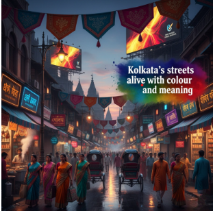
Why Kolkata Audiences Require a Unique Colour Approach
Kolkata’s audiences respond to colours in unique ways. This is because different people have different preferences. For example, audiences in Kolkata, like young urban professionals — the tech and career-oriented ones — prefer blue and white to represent their brands visibly in the digital realm. Similarly, traditional and family-oriented consumers have a preference for red and golden colours, as they have a great impact on their festivity and luxury participation. This conjures the people of Durga Puja in their traditional setting and cultural gathering.
Simultaneously, emerging brands in Kolkata adopt pastel shades such as blue and black to convey innovation and professionalism. At the same time, modern brands in Kolkata also embrace cooler tones like blue and grey to project professionalism and modernity. The key equilibrium is combining energy with elegance for a sensation that feels mutually cultural and classic.
Examples of Successful Brand Colour Usage in Kolkata
Kolkata-based and Indian brands are leveraging colour psychology to build strong emotional connections with their audience.
Take, for instance, TATA Steel / TATA Consultancy Service, a corporate and technology company, is recognised with blue & white branding, which symbolises purity, trust and competence. To them, using this colour is to showcase what services they offer and the outcome each user is set to achieve.
Similarly, Hindustan Times Kolkata Edition, a media and news brand, uses blue and orange to ignite credibility, seriousness, and enthusiasm, appealing to readers.
These examples above demonstrate that when brands choose and use colour wisely, it reflects in the customers they attract and builds and creates a memorable experience. Using the best colour for your brand can tell your brand’s story authentically to the reader before exploring your site.
Steps to Choose the Right Brand Colours for Kolkata Audiences
Get your brand’s colours just right with these simple steps;
- Step 1 – Know your audience. Make inquiries about what colours resonate with your ideal customers. For Kolkata consumers, colours are connected to traditional festivities. Colours tied to tradition and festivity often work best.
- Step 2 – Carefully arrange your colour pairings. Pick two or three main colours and add two highlight shades that look good together. Ensure they are appropriate for all media formats, including digital, print, and packaging.
- Step 3 – Perform visual experiments or A/B tests to assess audience engagement. A colour that looks attractive on digital platforms might not be as effective when applied to physical materials. Necessary changes can be made based on feedback to establish a cohesive visual aesthetic.
Ultimately, understanding the historical psychology of brand colours is essential for shaping a brand’s perception and creating clarity of the core purpose and solutions your brand stands for.
Smart brands select colours not solely based on their aesthetic appeal, but also for their significance to their audience.
Brands that stand out understand that colour choice isn’t only about beauty but about connection and meaning.
Effectively leveraging colour can drive traffic to your site, build credibility and create a long-lasting first impression of your brand.